

Do you ever feel like your artwork lacks depth? I did, too. Then, I discovered the secret weapon: the foreground.
In this article, you’ll learn:
- What foreground actually is (in simple terms)
- Why it’s the KEY to creating depth in your art
- Practical techniques used by famous artists
- Step-by-step ways to improve your artwork
I’ve spent 15 years teaching art workshops, and foreground issues are the #1 problem I see. Once they understand this concept, even beginners can create stunning depth.
Whether you’re painting landscapes, portraits, or still life, mastering the foreground will transform your art from flat to fascinating.
I promise that by the end of this article, you’ll see your canvas differently and have the tools to create artwork that pulls viewers in instead of leaving them cold.
Understanding Foreground- The Basics
The foreground is the part of an artwork that appears closest to you. Think of it as the “front row” of your painting.
What Exactly Is Foreground?
In technical terms, the foreground is the area of your composition that sits between the viewer and the main subject. It occupies the bottom portion or edges of your artwork in most cases.
When you look at a landscape in real life, the foreground is what you can reach out and touch—the grass at your feet, the rocks beside the path, or the flowers just in front of you.
The Three-Layer Approach
Most traditional compositions use a three-layer approach:
- Foreground – The closest elements (bottom 1/4 to 1/3 of the image)
- Middle ground – The main subject area (center of the image)
- Background – The distant elements (top portion of the image)
These layers work together to create the illusion of depth on a flat surface.
The Foreground in Different Art Styles
Foreground works differently across art styles:
- In realistic art, the foreground contains the most detail and texture
- In impressionist work, the foreground often has the boldest brush strokes
- In abstract art, foreground elements might be larger or use warmer colors
Even photography uses foreground—those blurry leaves framing a portrait? That’s an intentional foreground.
Have you ever taken a photo where everything seemed too far away? That’s what happens when you forget about the foreground.
Why Foreground Matters in Art
Foreground isn’t just a technical term. It’s a game-changer for your artwork.
Here’s why:
- Creates depth and dimension – Without foreground, your painting looks flat—like a wall instead of a window.
- Guides the viewer’s eye – I place objects in my foreground to lead you where I want you to look.
- Adds story and context – Those details up close? They tell you what’s happening right now.
- Establishes scale – Foreground elements help viewers understand how big everything else is.
- Creates emotional impact – The closer something appears, the more immediate its emotional effect.
- Frames your composition – Foreground elements can act as natural borders for your main subject.
Simply put, the foreground is how you pull people into your world.
Common Elements Found in the Foreground
What works best in the foreground?
I’ve tried countless elements, but these stand out:
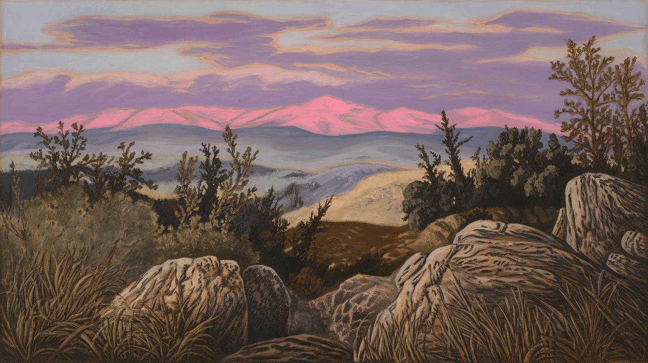
- Large, Detailed Objects: The closer something is, the bigger and more detailed it should be. Rocks, fallen logs, or architectural elements create instant depth.
- Contrasting Colors: Bold, vibrant colors in the foreground create a visual punch. They draw the eye first and establish the entry point to your composition.
- Texture and Patterns: The rough bark of a tree or ripples in water looks amazing up close. Texture creates tactile interest that pulls viewers in.
- People or Animals: A figure in the foreground instantly creates narrative interest. It also provides scale, helping viewers understand the overall scene.
- Framing Elements: Trees, archways, or window frames that partially border the view create a natural “looking through” effect.
Remember – Your foreground doesn’t need all these elements. Even one well-placed object can work magic.
Techniques Artists Use to Highlight the Foreground
Want to make your foreground pop?
Try these techniques I’ve learned:
- Size Contrast: Make foreground elements larger than background elements. This creates natural depth and helps establish spatial relationships.
- Color Intensity: Use brighter, more saturated colors upfront. Our eyes naturally perceive vivid colors as being closer to us than muted ones.
- Detail Focus: Put your sharpest details in the foreground, letting background elements stay softer. This mimics how our eyes naturally see the world.
- Overlapping: Let foreground objects cut in front of middle ground elements. This simple technique instantly creates convincing depth.
- Shadow Anchoring: Place shadows beneath foreground objects to ground them. This prevents them from appearing to float.
I used to overwork my entire canvas. Now, I save my energy for those foreground details that truly matter.
Famous Artworks That Showcase Foreground Well
You don’t have to take my word for it.
Look at how these masters used foreground:
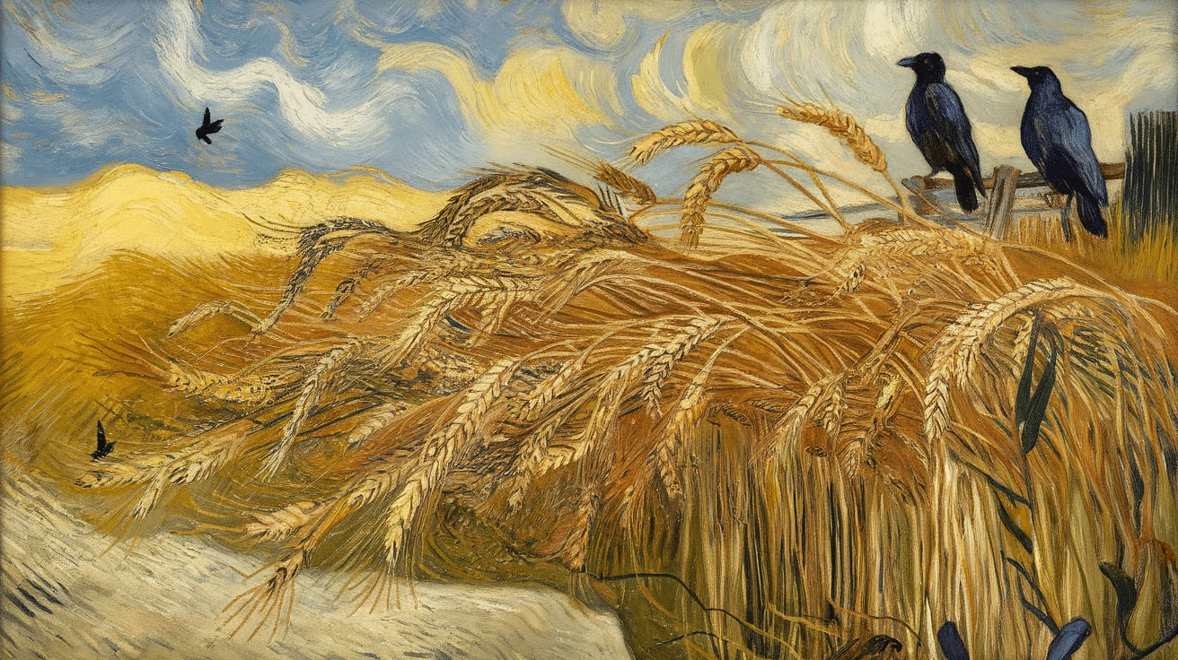
- Vincent van Gogh’s “Wheat Field with Cypresses” uses large, swirling wheat stalks in the foreground to draw you in.
- Claude Monet’s “Water Lilies” places detailed flowers right up front, creating an intimate feeling.
- Georgia O’Keeffe’s “Oriental Poppies” turns the foreground into the entire subject with her dramatic close-up approach.
- Caspar David Friedrich’s “Wanderer Above the Sea of Fog” positions a figure in the foreground, creating both scale and narrative.
- Pieter Bruegel’s “Hunters in the Snow” uses dark figures and trees in the foreground to frame the winter scene beyond.
What do they all have in common? They use the foreground to create a personal connection with viewers.
How to Improve Your Art Using Foreground
Ready to enhance your artwork?
Here’s what works for me:
- Start with the foreground. Plan it first, not last.
- Use references. Take photos focusing on objects close to you.
- Practice scale. Make foreground elements larger and more detailed than background ones.
- Create overlap. Let foreground objects partially block middle-ground elements.
- Add a focal point in the foreground—something that catches the eye immediately.
The best part? You can try these techniques right away with any medium.
Conclusion
The magic of the foreground isn’t complicated, but it is powerful. I’ve watched students transform their work after just one lesson on this technique.
Remember these key points:
- The foreground creates the entry point into your artwork
- It builds depth through contrast, size, and detail
- Even simple foreground elements can dramatically improve your composition
The difference between amateur and professional-looking art often comes down to this single element. I still check my foreground first whenever I feel something’s “off” in my work.
Start paying attention to the foreground in the art you admire. Then, experiment with your next piece. Add something bold up front. Play with overlap. Increase details.
Your viewers will feel the difference immediately—even if they can’t explain why.
Frequently Asked Questions
What’s the Ideal Ratio Between Foreground, Middle Ground, and Background?
There’s no perfect formula, but the Rule of Thirds is a good starting point. Dedicate roughly one-third to the foreground, especially when you’re learning.
Can Negative Space Work as a Foreground?
Absolutely! Space that sits “in front” creates dramatic depth. Think of looking through a window frame or between tree branches.
How Do I Prevent My Foreground from Overwhelming the Subject?
Use foreground elements that frame or lead to your subject rather than compete with it. Keep colors complementary and slightly darker than your focal point.
What’s One Quick Trick to Improve Foreground Instantly?
Add a single detailed object at the bottom edge of your composition that appears “cut off” by the frame. This creates the illusion that the scene continues beyond the canvas.
Should I Paint My Foreground First or Last?
I recommend sketching it first to plan composition, but painting it last. This allows you to adjust its details and intensity to balance with completed middle and background elements.