

Have you ever wondered why some artwork pops while others fall flat? The secret might be in the colors. In this article, I’ll show you how complementary colors can transform your art from boring to brilliant.
I’ll share everything you need to know about complementary colors—what they are, how they work, and how to use them effectively in your artwork.
Whether you’re a beginner or an experienced artist, these tips will help you create more dynamic and eye-catching pieces.
Many famous artists throughout history have used this color technique to create masterpieces. By the end of this article, you’ll be ready to use this powerful tool in your creative work.
What Are Complementary Colors?
Complementary colors are pairs of colors that sit opposite each other on the color wheel.
When placed next to each other, they create a strong visual contrast that makes both colors appear brighter and more vivid.
Think of complementary colors as color teammates that work together to make each other shine. They have a special relationship that can make your artwork stand out.
Examples of Complementary Color Pairs
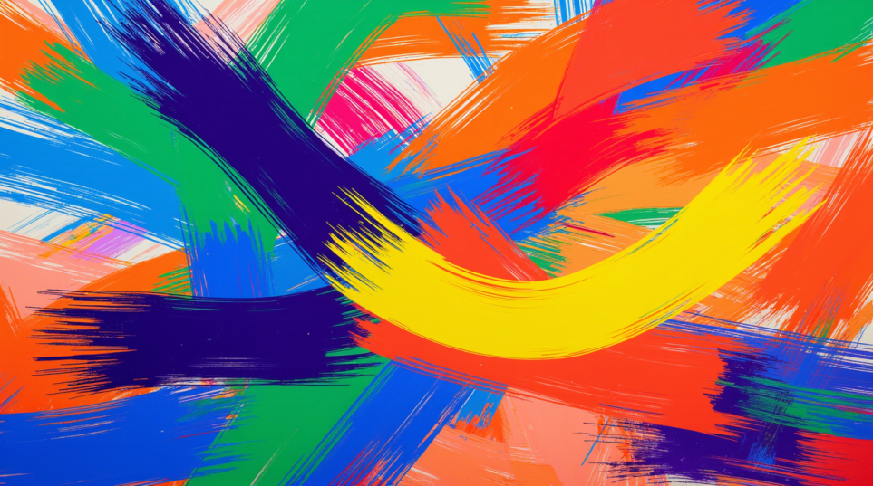
The three main complementary color pairs are:
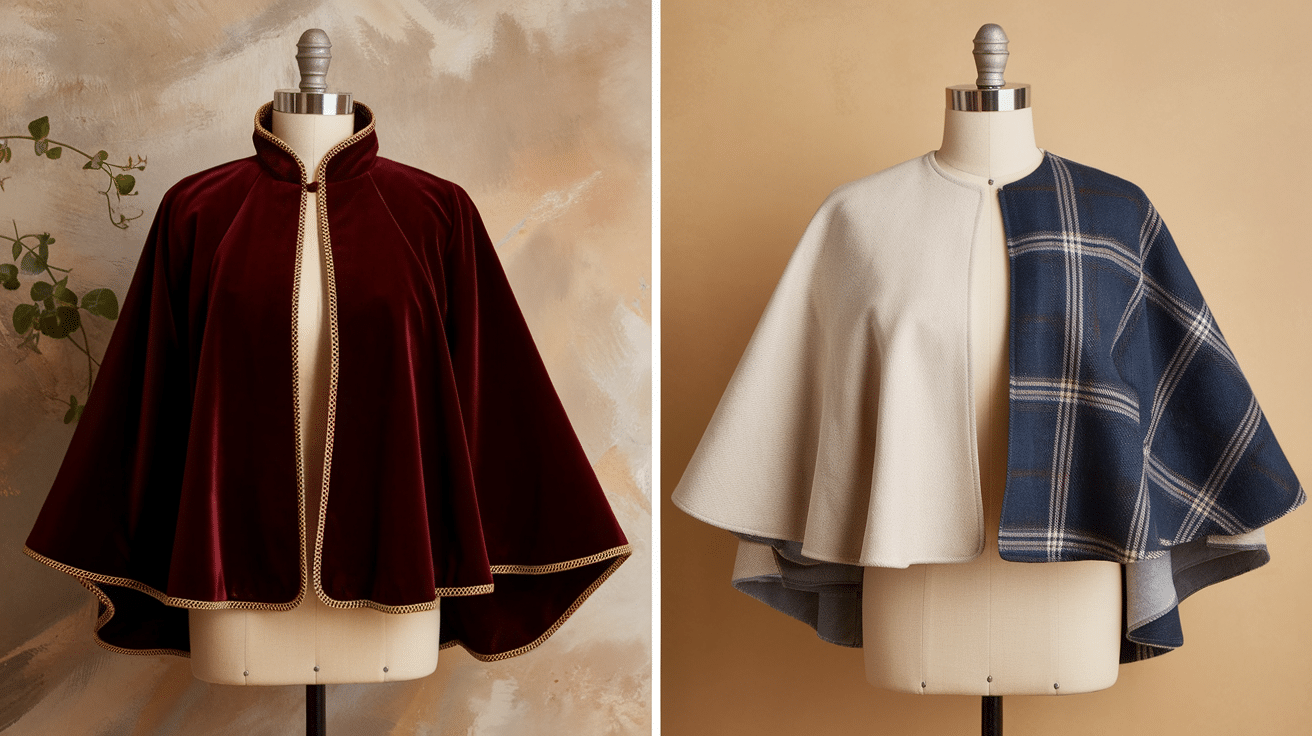
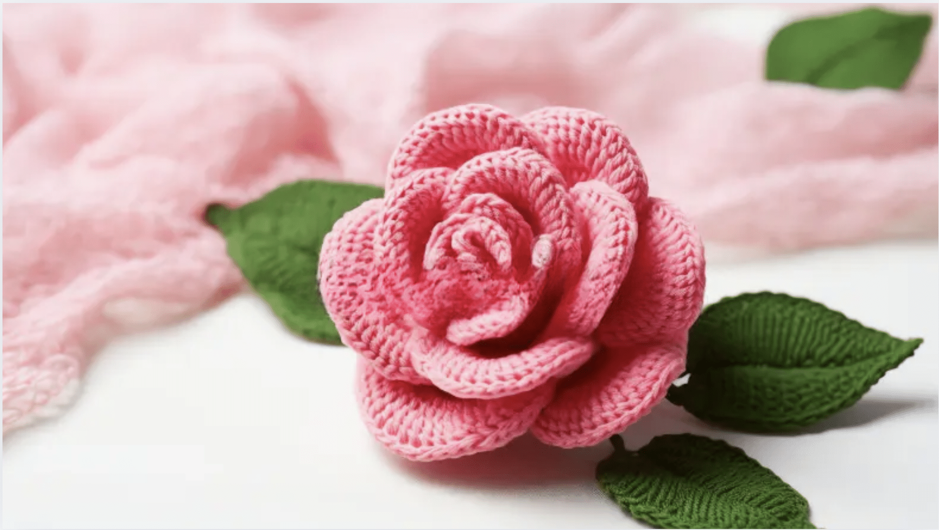
- Red and Green: Think Christmas colors or the classic look of red roses with green stems
- Blue and Orange: This pair creates the dramatic look of a sunset against a blue sky
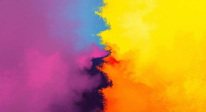
- Yellow and Purple: These colors create a royal and striking combination
When you place these colors next to each other in your artwork, they seem to vibrate and create energy. This is why they’re so powerful!
How Complementary Colors Work in Art
Creating Contrast and Balance
Complementary colors create strong visual contrast because they’re so different from each other. This contrast can:
- Draw the viewer’s eye to important areas
- Create a sense of energy and movement
- Make colors appear more intense and vibrant
Artists use this contrast to create balance. Too much of one color can make artwork feel one-sided, but adding its complement brings harmony.
The Role of Complementary Colors in Color Harmony
Color harmony means creating a pleasing arrangement of colors. Complementary colors play a big role in this because they naturally balance each other.
When complementary colors are used in art, they create natural tension and resolution. This gives your artwork both energy and stability.
Have you ever noticed how blue skies make orange sunsets look even more amazing? That’s complementary color harmony at work!
Uses of Complementary Colors in Art
Enhancing Focus and Visual Impact
Want to make something stand out in your artwork? Place it against its complementary color!
For example:
- A red apple looks extra vibrant against a green background
- Purple flowers pop against yellow fields
- Orange fish appear to swim off the canvas against blue water
Artists have used this technique for centuries to draw attention to the most important parts of their paintings.
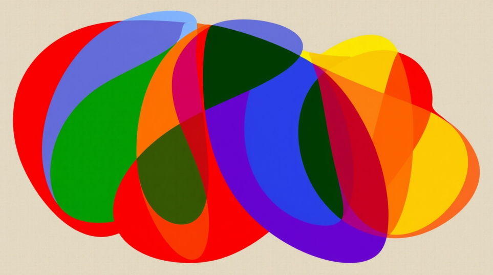
Color Schemes with Complementary Colors
You can get creative with how you use complementary colors:
- Split-complementary: Use one color with the two colors adjacent to its complement
- Double-complementary: Use two pairs of complementary colors together
- Complementary with neutrals: Add black, white, or gray to soften the effect
These schemes give you more options while still keeping the power of complementary colors.
Tips for Using Complementary Colors Effectively
Choosing the Right Combinations
Not all complementary pairs will work for every project. Here’s how to choose the right ones:
- Consider the mood you want to create (yellow/purple can feel royal and luxurious)
- Think about your subject matter (blue/orange works well for landscapes with skies)
- Look at the values (light/dark contrast) as well as the hue
The best combinations often come from experimenting, so don’t be afraid to try different pairs!
Avoiding Overuse
Too much of a good thing can be overwhelming. When using complementary colors:
- Use different amounts of each color (try 80% of one color and 20% of its complement)
- Adjust the intensity by mixing in some gray or white
- Create transitions between the colors with in-between shades
This helps prevent your artwork from becoming too harsh or “loud.”
Conclusion
Complementary colors are one of the most powerful tools in an artist’s toolkit. They create contrast, harmony, and visual interest that can take your artwork to the next level.
Now it’s your turn to experiment! Try using complementary colors in your next art project. Start small if you’re nervous – maybe just add a touch of the complementary color to see how it affects your work.
Remember that the greatest artists all learned by experimenting. The more you play with complementary colors, the better you’ll get at using them to create stunning artwork that catches everyone’s eye.
Frequently Asked Questions
What Are the Primary Complementary Colors in Art?
The primary complementary pairs are red and green, blue and orange, and yellow and purple.
Can Complementary Colors Be Used in All Types of Art?
Complementary colors can be used in painting, drawing, digital art, photography, and even crafts or home decor.
Why Are Complementary Colors Important in Art?
They create a strong contrast, visual excitement, and balance in your artwork. They make colors appear more vivid and can direct the viewer’s attention.
Can Complementary Colors Be Used Subtly?
You can use muted versions of complementary colors or use small amounts of one color against larger areas of another for a more subtle effect.
How Do I Fix a Painting Where Complementary Colors Have Mixed and Turned Muddy?
Try adding fresh layers of each pure color separately rather than mixing them further. You can also embrace the neutral tones by adding more gray or black to create depth or use white to lighten muddy areas and make them part of your background.