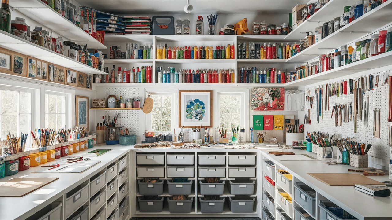

Good design makes a project look clear, balanced, and easy to understand. It helps things stand out and keeps everything in the right place.
The basic principles of design guide how shapes, colors, and spaces work together. These rules help create designs that look good and make sense.
Some key principles include balance, contrast, alignment, and repetition. These simple ideas help organize a design so it looks neat and works well. When these rules are used correctly, a design feels natural and is easy to follow.
Understanding these principles can improve any project, from schoolwork to home decor or business branding.
Knowing how to use space, colors, and patterns can make a big difference. This blog will cover the most important design principles and explain how they help create better projects.
Why Design Principles Matter in Any Project
Design principles are not just for professional designers. They are useful in everyday projects, from school assignments to home decorations and even business branding.
Good design improves communication, makes content more engaging, and helps people understand information more easily.
How Good Design Improves Communication
A well-designed project makes it easy to find key details. Good design ensures that important information stands out, whether it’s a website, a brochure, or a classroom poster.
Using contrast, alignment, and hierarchy can help guide the viewer’s eye to what matters most.
The Impact of Design on User Experience
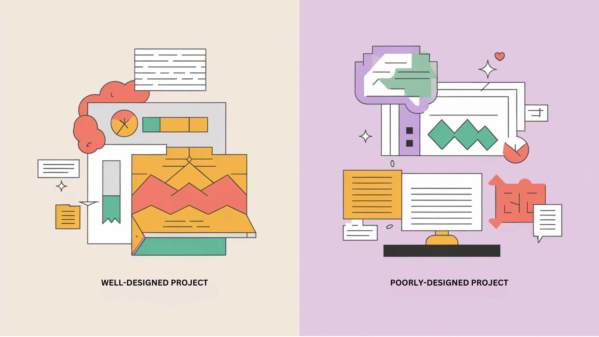
When a project follows good design principles, it becomes easier to use. For example, websites with clear layouts, proper spacing, and readable fonts keep visitors engaged.
On the other hand, poorly designed websites with cluttered layouts and hard-to-read text push users away.
Real-Life Examples of Effective Design
Think about some of the most popular brands. Companies like Apple, Nike, and Coca-Cola use simple yet effective designs in their logos, packaging, and advertisements.
Their designs are clean, memorable, and easy to recognize because they follow design principles like balance, contrast, and repetition.
Understanding the Core Principles of Design
Before creating any project, knowing the basic principles that guide good design is important. These principles help organize elements like color, space, and text to create a visually appealing and effective design.
When applied correctly, they improve clarity, balance, and structure. Below are the key principles that every project should follow.
1. Balance: Keeping the Design Even

Balance is about making sure all elements in a design are evenly distributed. If one side of a design has too much weight, it can feel off or uncomfortable to look at. There are three main types of balance:
- Symmetrical Balance: Symmetrical balance means both sides of a design look the same or very similar. This creates a formal and stable look. A common example is a book cover where the title is centered, and the design on both sides is equal.
- Asymmetrical Balance: Asymmetrical balance happens when different elements are used to create an even look. For example, a large shape on one side can be balanced by a group of smaller shapes on the other.
- Radial Balance: Radial balance occurs when elements are arranged around a central point. Think of a flower or a clock—everything spreads out evenly from the middle. This type of balance creates harmony and movement in a design.
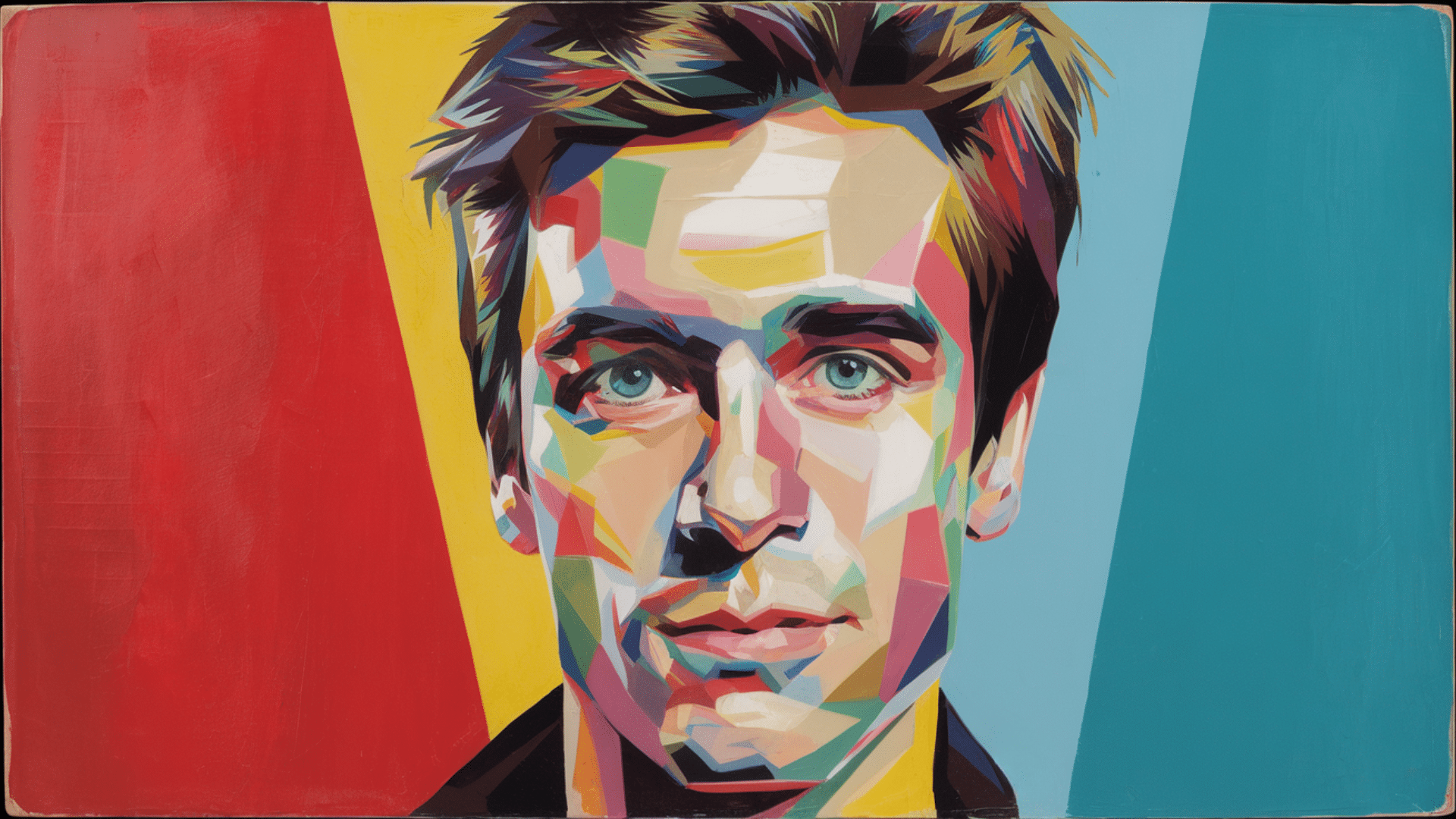
2. Contrast: Making Elements Stand Out

Contrast helps different elements stand out from each other. Without contrast, everything in a design looks the same, making it hard to focus on important details. There are several ways to add contrast to a design:
- Color Contrast: Using light and dark colors together can create a strong contrast. For example, black text on a white background is easy to read because of the strong color difference.
- Size Contrast: Making some elements bigger and others smaller creates visual interest. A large headline paired with smaller text helps direct attention to the most important information.
- Shape Contrast: Mixing different shapes can make a design more engaging. A design with only squares may feel dull, but adding circles or triangles can make it more dynamic.
3. Alignment: Organizing Everything Properly

Alignment helps create order in a design. It makes everything look neat and connected. Without proper alignment, a project can look messy and hard to follow.
- Left, Right, or Center Alignment: Most text and images are aligned to the left, right, or center. Choosing one alignment style helps keep everything organized. For example, newspapers use left-aligned text to make reading easy.
- Grid Alignment: A grid layout helps place elements evenly across a design. Websites and posters often use grid alignment to make sure everything lines up correctly.
4. Repetition: Creating a Consistent Look
Repetition helps tie a design together. Using the same colors, fonts, or shapes throughout a project makes it look professional and organized.
- Repeating Colors and Fonts: Using the same font for headings and body text keeps things consistent. Repeating the same colors across different parts of a design also helps everything look connected.
- Repeating Patterns and Shapes: Repeating shapes or patterns can create rhythm in a design. For example, a website might use the same button style on every page to make navigation easier.
5. Proximity: Keeping Related Elements Together

Proximity means placing related elements close to each other. This helps group information in a way that makes sense. If things are too far apart, it can be hard to understand how they connect.
- Grouping Text and Images: On a flyer, a headline should be close to the related image so readers know they go together. If the headline is too far away, it might cause confusion.
- Spacing Between Elements: Too much space between elements can make a design feel empty, while too little space can make it feel crowded. Finding the right balance keeps things easy to read and visually appealing.
6. White Space: Letting the Design Breathe

White space, also called negative space, is the empty space around elements in a design. It helps improve readability and makes the design look clean.
- Why White Space is Important: A design with too much content and no white space feels cluttered. White space gives the eyes a break and helps guide attention to important details.
- Using White Space Effectively: Adding space between text, images, and other elements makes a project look professional. Magazines, websites, and advertisements often use white space to create a clean and modern look.
7. Hierarchy: Directing Attention to What Matters Most
Hierarchy helps organize information by importance. The most important parts should be the biggest and most noticeable.
- Using Size to Show Importance: Large headlines grab attention first, while smaller text provides details. This guides readers to look at key information first.
- Using Bold and Color to Highlight Key Elements: Bold fonts and bright colors can highlight important details. A call-to-action button on a website is often a bright color to make it stand out.
8. Movement: Leading the Eye Through the Design

Movement controls how the eye travels across a design. A well-designed project guides the viewer from one element to another in a natural way.
- Using Lines and Shapes to Create Flow: Diagonal lines or curved shapes can direct attention. For example, an arrow in a design can point to an important message.
- Placing Elements in a Natural Order: People usually read from left to right and top to bottom. Placing important details where the eye naturally moves helps improve the design’s flow.
9. Unity: Making Everything Fit Together
Unity means all elements in a design work well together. A project with unity feels complete and well-organized.
- Choosing a Consistent Style: Using the same font style, color scheme, and design elements throughout a project helps create unity. A mix of too many different styles can make a design feel unorganized.
- Connecting Elements Through Spacing and Alignment: Proper spacing and alignment help elements connect visually. If everything is placed randomly, the design won’t feel unified.
10. Simplicity: Keeping It Clean and Clear
Good design is simple. Too many elements can overwhelm the viewer. Keeping things clean and easy to understand makes a design more effective.
- Avoiding Too Many Fonts and Colors: Using too many fonts and colors can make a design look messy. Sticking to a few consistent choices helps keep things simple.
- Removing Unnecessary Elements: Extra decorations or images that don’t add value should be removed. Every part of a design should have a purpose.
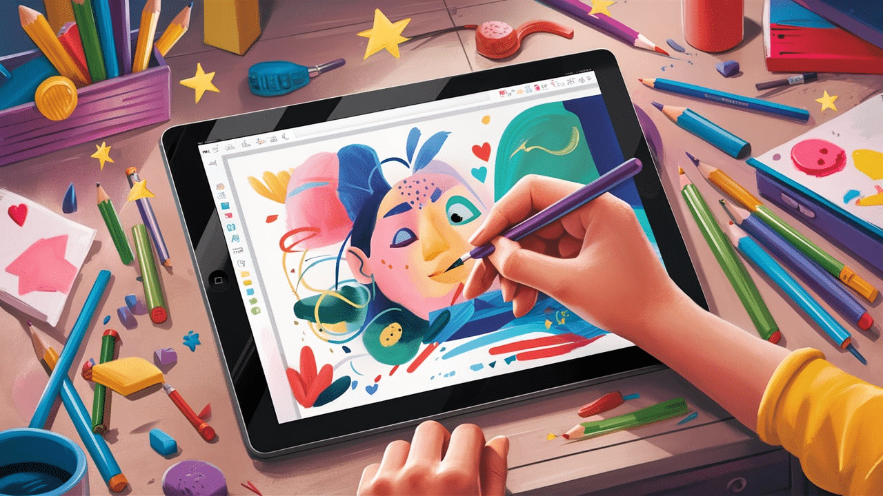
How to Apply Design Principles to Different Projects
Design principles are useful in many different areas. They help improve everything from graphic design to interior decorating and business branding. Some ways you can apply these principles to different types of projects:
Using Design Principles in Graphic Design
Graphic design includes things like posters, brochures, and digital content. Applying balance, contrast, and alignment can make a big difference in making designs look polished and professional.
Tips:
- Keep text and images aligned for a clean look.
- Use contrast to make important elements stand out.
- Repeat colors and fonts to create a consistent style.
Applying Design Rules in Interior Decor
Design isn’t just for digital or printed projects—it also applies to home decor. The way furniture, colors, and decorations are arranged can make a space feel balanced and inviting.
Tips:
- Use balance by arranging furniture evenly in a room.
- Add contrast by mixing light and dark colors.
- Keep unity by sticking to a consistent theme or color palette.
How Businesses Use Design to Attract Customers
Companies use design principles in branding, packaging, and marketing materials. A well-designed logo, website, or product package can make a business look more trustworthy and appealing.
Tips:
- Use hierarchy to make the most important information stand out.
- Keep branding consistent with the same colors, fonts, and style.
- Make sure the design is clear and easy to understand.
Common Mistakes in Design and How to Avoid Them
Even with the best intentions, it’s easy to make design mistakes. Some small errors can make a project look messy or hard to understand. Some common design mistakes and how to fix them:
Overcrowding a Design with Too Many Elements
Too much text, too many images, or too many colors can make a design feel overwhelming. When everything demands attention, nothing stands out.
How to Fix It:
- Use white space to give the design room to breathe.
- Focus on the most important elements and remove anything unnecessary.
- Keep the design simple and clean.
Poor Color Choices That Affect Readability
Using colors that don’t work well together or choosing low-contrast colors can make text hard to read.
How to Fix It:
- Use high contrast between text and background (like black text on a white background).
- Stick to a color palette that is easy on the eyes.
- Avoid using too many bright or clashing colors.
Ignoring Alignment and Spacing
If elements are placed randomly without proper alignment, the design can look unorganized. Uneven spacing also makes a project feel unbalanced.
How to Fix It:
- Align text and images properly using grids or guidelines.
- Keep consistent spacing between elements.
- Use left, right, or center alignment instead of mixing different styles.
Using Too Many Fonts
Mixing too many fonts can make a design look unprofessional and messy.
How to Fix It:
- Stick to two or three fonts that complement each other.
- Use one font for headings and another for body text.
- Make sure the fonts are easy to read.
Conclusion
Good design makes a project clear, organized, and easy to understand. Using balance, contrast, alignment, repetition, and other key principles helps improve any design.
These simple rules ensure that elements work together to create a clean and effective layout.
Small changes, like proper spacing, color contrast, and alignment, can make a big difference. A well-balanced design feels professional and is easier to follow. Avoiding common mistakes, such as overcrowding and poor color choices, keeps a project looking neat.
These principles apply to many areas, including graphic design, interior decor, and branding. They help create visually appealing and functional designs.
By practicing these rules, anyone can improve their work and make it more engaging. Good design is not just about looks—it helps people understand and connect with the content.
Keeping things simple, structured, and balanced leads to a better and more effective final result.
Frequently Asked Questions
Why are design principles important?
Design principles help create clear, organized, and visually appealing projects. They guide how elements like color, space, and text work together to improve readability and effectiveness.
How can I improve my design skills?
Practice using balance, contrast, alignment, and other principles in your projects. Study well-designed examples, use design tools, and experiment with different layouts to see what works best.
What is the most important design principle?
No single principle is the most important. All principles work together to create a strong design. However, balance and contrast are key to making a project look polished and professional.
How does white space help in design?
White space improves readability and makes a design look clean. It prevents overcrowding and helps focus attention on important elements.